8 myths about using color in interiors
- Susan Fisher

- May 14, 2022
- 4 min read
Color is life, it's energy and a great ally to bring personality to our homes.
The vast majority of people like color, but don't know how to use it in interiors. This, combined with a fear of change and prejudices make our choices of color or repertoire very limited.
#1 White ceilings make a room more spacious
White reflects light better than any other color, but that doesn't mean we need to just use white on ceilings.
Adding color to the fifth wall can create a visual effect by drawing attention up and making a space appear larger.
Colored ceilings are very popular at the moment and in the right space with the right lighting, they can help in creating unique spaces. If the ceiling has any special details, such as beams or plaster moldings, color can also be very effective in drawing attention to these attractions.


#2 Only three colors can be combined at the same time
There is a strong belief that 3 colors is the ideal number for a palette. This includes a dominant color, a secondary color, and an accent color. But this should only be understood as one of the many possible recipes. What's important is knowing that too few colors will make the palette dull and too many colors will make the palette messy. There is a balance - which depends a lot on the purpose of the palette - that only the author will know how to define.


3# Poorly lit spaces should be painted white
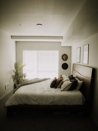
Usually people use white so that the environment is lit, but the truth is that if the environment is not naturally bright, white will never look good. For example, north-facing rooms just don't glow white. On the contrary, they look dull and lifeless (image 1). White paint only works wonders in well-lit environments. In poorly lit environments, it is better to use colored paints, to bring depth, texture, life and warmth (image 2). Wallpaper can also be our ally in a dark corner (image 3)


#4 Dark colors are sad
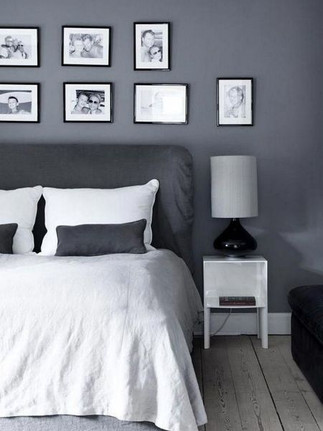
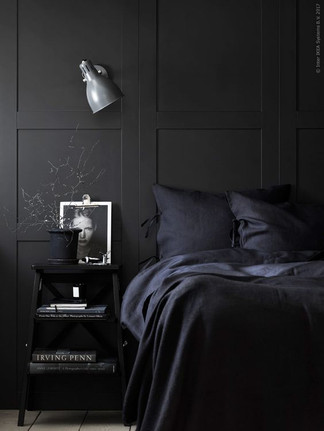
While it is true that dark colors are denser and, depending on the color, can weigh more heavily on the environment, this is very different from being sad colors. I believe that if there is one color that can be understood as sad, it is gray. Gray (without an expressive undertone like in image 1) is a color void of emotions. If there are colors that are sadder, it is not the dark ones, but the gray ones, those with less color vibration. The dark environments in images 2 and 3 are far from being sad, on the contrary, they have the potential to create cozy spaces full of personality.


#5 Small rooms should be white or a pale neutral color
While white paint can help a room look bigger, dark colors can do the same, perhaps not in the way you'd expect. Dark hues can “blunt” the edges and corners of a room (example 3 above), because they reflect less natural light than light colors. In this way, an illusion of more space is achieved. If you want to opt for a lighter color, you can deceive creating the feeling of greater space with the help of mirrors. A small room has the potential to become an intimate space - an escape from the rest of the world.
#6 There are colors that should never be used together
Over time I've heard from a lot of people who have color prejudices that don't match. Some examples are red and pink, brown and blue, black and dark blue, or pink and orange. But I firmly believe that all colors go with all colors and the secret is in the attention and tuning of the right shades, more than the right colors.


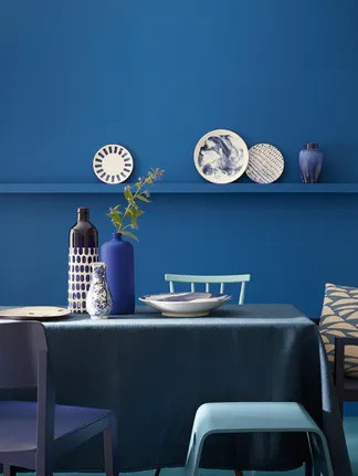
#7 Blue is the color of calm
The psychological symbology of the color blue is calm and tranquility. But that depends a lot on the shade of blue. These three examples of blues can generate different emotions in different people, but in general terms light blue generates calm while electric blue does not. You always have to "listen" to what each shade says and be open to being surprised by energetic blues, calm oranges and sad yellows.


#8 Every room should be a different color to show individuality
Have you ever walked through a house where every room was a different color and felt like you went to the circus? Individuality in bedrooms doesn't have to be as dramatic as finding an entirely different color. Choosing a coordinated color palette for the entire house, being consistent and repeating some colors on objects, fabrics or furniture throughout the house will help the rooms visually flow.

Strict rules on the use of colors also limit the possibilities and use them freely, but almost always the rules can be broken.
These are just some of the main myths about color in interior decoration that I demystify to bring more color to our interiors and take advantage of the full potential that color has to offer us.
About the author:
 | Susan Fisher's mission is to help people think about color outside the box. She has been involved in different areas and projects in the past, but after living in the vibrant and colorful city of Lisbon for a while, her heart took her back to color and she decided to train as an International Color Consultant to help people create inviting, colorful spaces they love. Instagram: @unbox.color Email: susan@unboxcolor.com |
Follow us:


Comments